Discover how website design impacts SEO rankings. Learn the 6 key factors that affect your search visibility and boost your site’s performance. You’ve spent months perfecting your SEO strategy. Your keywords are on point, your backlinks are strong, and your content is stellar. But somehow, your rankings aren’t budging. What gives?
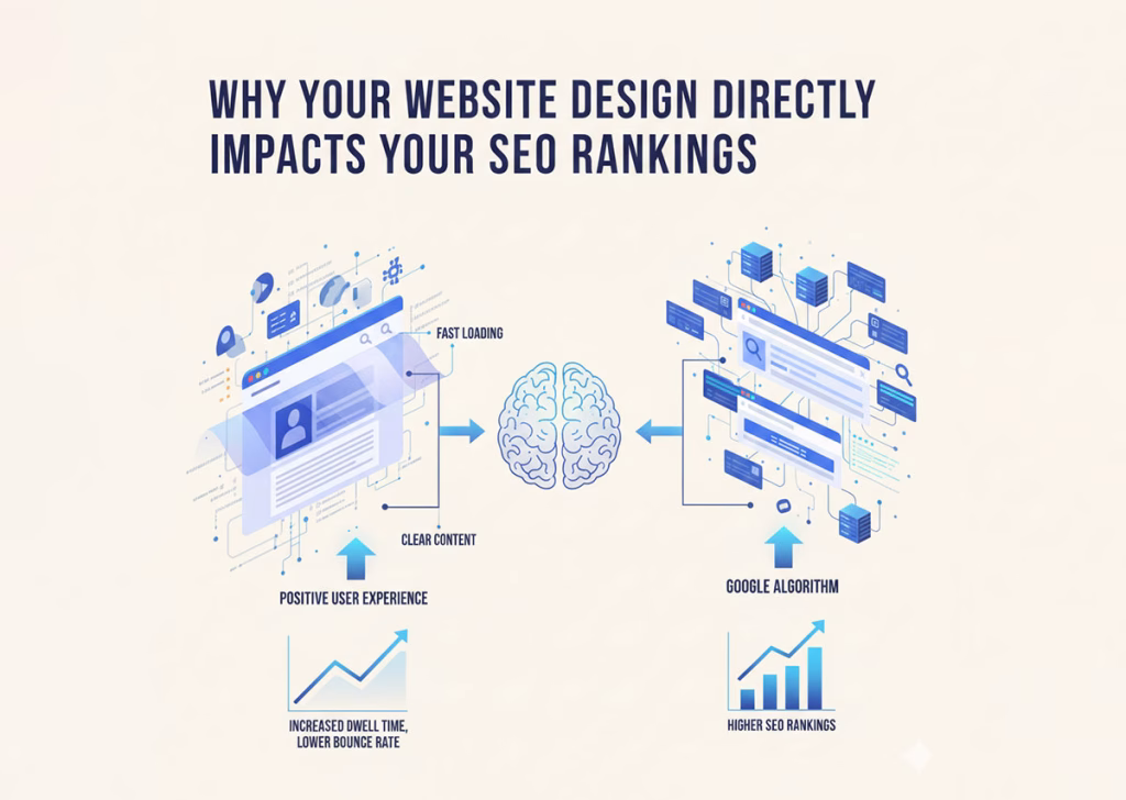
Here’s what many business owners miss: search engines don’t just evaluate your content—they evaluate the entire user experience. And your website design plays a massive role in that equation.
Google’s algorithm has evolved far beyond simple keyword matching. It now considers how visitors interact with your site, how quickly pages load, and whether users can actually find what they’re looking for. A poorly designed website can sabotage even the most sophisticated SEO efforts.
Let’s explore exactly how design influences your search rankings and what you can do about it.
The Top 6 Factors That Directly Impact SEO Rankings
Discover the 6 key factors that impact SEO rankings. Learn how to optimize your site for better visibility and higher search engine performance.
Page Speed Makes or Breaks Your Rankings
Nobody likes waiting for a slow website to load. Google knows this, which is why page speed became an official ranking factor years ago.
Research shows that 53% of mobile users abandon sites that take longer than three seconds to load. When visitors bounce immediately, Google interprets this as a signal that your site doesn’t meet user needs. Your rankings drop accordingly.
Design elements that commonly slow down websites include:
- Oversized images and unoptimized media files
- Excessive JavaScript and CSS
- Too many plugins or third-party scripts
- Render-blocking resources
The solution? Compress your images, minimize code, enable browser caching, and use a content delivery network (CDN). These technical improvements might seem minor, but they compound into significant ranking advantages.
Mobile Responsiveness Isn't Optional Anymore
Google switched to mobile-first indexing in 2019. This means the search engine primarily uses the mobile version of your site for ranking and indexing. If your website doesn’t work well on smartphones, you’re essentially invisible to a huge portion of searchers.
A mobile-responsive design automatically adjusts layout, images, and navigation based on screen size. But true mobile optimization goes deeper than that. Consider:
- Touch-friendly buttons and links (at least 48×48 pixels)
- Readable text without zooming (minimum 16px font size)
- Simplified navigation for smaller screens
- Fast load times on cellular networks
Test your site on multiple devices regularly. What looks perfect on your desktop might be a frustrating mess on a phone.
Navigation Structure Guides Both Users and Crawlers
Think of your website’s navigation as a roadmap. When it’s clear and logical, both visitors and search engine crawlers can easily find important pages. Confusing navigation does the opposite—it creates dead ends and frustration.
Effective navigation should:
- Use descriptive labels instead of vague terms like “Services” or “Solutions”
- Limit main menu items to seven or fewer
- Include a search function for larger sites
- Provide breadcrumb trails showing users where they are
- Link to important pages from the homepage
Search engines use your internal linking structure to understand which pages matter most. If key pages are buried three clicks deep with no internal links pointing to them, Google assumes they’re not important. Strategic navigation helps distribute link equity throughout your site.
Visual Hierarchy Keeps Visitors Engaged
When someone lands on your page, their eyes follow predictable patterns. Good design leverages this psychology to guide attention toward important content. Poor design creates visual chaos that drives people away.
High bounce rates and short dwell times send negative signals to search engines. If users consistently leave your site within seconds, Google questions whether your content actually matches search intent.
Create clear visual hierarchy by:
- Using size and color to emphasize important elements
- Breaking up text with subheadings, lists, and white space
- Placing crucial information “above the fold”
- Incorporating images and graphics that support your message
- Ensuring sufficient contrast between text and background
Remember, people scan rather than read online. Make your content scannable and you’ll keep visitors engaged longer.
User Experience Signals Matter More Than Ever

Google’s algorithm updates increasingly focus on user experience metrics. Core Web Vitals—introduced in 2021—measure loading performance, interactivity, and visual stability. These metrics directly affect rankings.
Here’s what each Core Web Vital assesses:
- Largest Contentful Paint (LCP): How quickly the main content loads (should be under 2.5 seconds)
- First Input Delay (FID): How fast your site responds to user interactions (should be under 100 milliseconds)
- Cumulative Layout Shift (CLS): Whether elements unexpectedly move as the page loads (should be under 0.1)
Design choices directly influence these metrics. Auto-playing videos, pop-ups that appear too quickly, and ads that shift content all create poor experiences that harm rankings.
Accessibility Expands Your Audience and Improves SEO
An accessible website works for everyone, including people with disabilities. This isn’t just ethical—it’s smart business and good for SEO.
Many accessibility best practices overlap with search engine optimization. For example:
- Alt text for images helps both screen readers and search crawlers understand visual content
- Descriptive link text improves navigation for all users
- Proper heading structure organizes content logically
- Sufficient color contrast makes text readable
Google can’t see your website the way sighted users do. It relies on the same structural elements that assistive technologies use. When you design with accessibility in mind, you’re simultaneously optimizing for search engines.
The Bottom Line: Design and SEO Work Together
Your website design isn’t just about looking professional. It’s about creating an environment where visitors can easily find information, engage with content, and take action. Search engines reward sites that deliver these experiences.
Start by auditing your current site. Run Google’s PageSpeed Insights tool, test mobile responsiveness, and review your navigation structure. Ask colleagues or customers for honest feedback about usability issues they encounter.
Small design improvements often yield surprising SEO benefits. Fix the biggest problems first, then work your way down the list. Your rankings—and your visitors—will thank you.